


 Max Mustermann
The theme ships with a handful of shortcodes - here they are, sorted alphabetically. Diagrams (Mermaid) and math (KaTeX) show up here in brief and are covered in depth in Diagrams and math.
Accordion #
Collapsible sections based on native <details> - no JavaScript at all.
By default only one entry is open at a time; with single="false" several may
be open. With open="true" an entry starts expanded.
{{< accordion >}}
{{< accordion-item label="What is a shortcode?" icon="puzzle" >}}
A reusable building block written as **Markdown**.
{{< /accordion-item >}}
{{< accordion-item label="Do I need JavaScript?" open="true" >}}
No - it uses native `<details>`/`<summary>`.
{{< /accordion-item >}}
{{< /accordion >}}
What is a shortcode?
Do I need JavaScript for this?
<details>/<summary> and works even with
JavaScript disabled.Can more than one entry be open?
single="false" to allow it.Amazon #
Renders an affiliate product as a card. You only pass the affiliate reflink; the
title, description, image and price come from a build-time cache
(data/products.yaml), which script/fetch-amazon-products.js fills from the
Amazon Creators API — the site build itself never calls Amazon. The
product image loads from Amazon’s CDN only after consent via Klaro, and the
link carries rel="sponsored" (which automatically shows the advertising
disclosure). The price is shown only while the cached data is fresh (< 24 h),
per Amazon’s terms.
{{< amazon "https://amzlink.to/az0sqPpjSZX54" >}}

Midea Portasplit Cool Mobile Klimaanlage nur Kühlung
It also works inside the card grid — drop several amazon shortcodes
between card-grid tags and they line up as equal-height cells:
{{< card-grid cols=2 >}}
{{< amazon "https://amzlink.to/az0sqPpjSZX54" >}}
{{< amazon "https://amzlink.to/az0demo1234" >}}
{{< /card-grid >}}
Midea Portasplit Cool Mobile Klimaanlage nur Kühlung

Raspberry Pi 5 (8 GB RAM)
Quad-Core Cortex-A76 @ 2,4 GHz, PCIe 2.0, Dual-4K-HDMI — der Einplatinenrechner für dein nächstes Homelab-Projekt.
Buttons #
A button is a link styled as a push button.
{{< button href="https://gohugo.io" target="_blank" >}}To the Hugo docs{{< /button >}}
{{< button href="https://example.com/produkt" sponsored="true" >}}Affiliate link{{< /button >}}
To the Hugo docs Affiliate link
With sponsored="true" the button gets a shopping-cart icon and
rel="sponsored" - which automatically shows the advertising disclosure
at the top of the page (scroll up and see). Instead of href you can also
pass pageRef="posts/01-willkommen" for internal targets.
Card #
Embeds a post, category, series or page as a card right inside the text - in
the same look as the cards on the list pages. The type is detected
automatically; type="article|category|series|page" overrides it.
{{< card "posts/01-willkommen" >}}
{{< card "series/example-series" >}}

Welcome to the tbsch theme
BasicsAn overview of the tbsch theme: what it can do, how this demo is structured and where to start.

Card grid #
Several cards side by side, in the same grid look as the hub pages. cols
(optional, default 2, at most 4) sets the desktop column count; on narrow
viewports the grid collapses to a single column. The content should consist
of card shortcodes.
{{< card-grid >}}
{{< card "posts/01-willkommen" >}}
{{< card "series/example-series" >}}
{{< /card-grid >}}
Welcome to the tbsch theme
BasicsAn overview of the tbsch theme: what it can do, how this demo is structured and where to start.
With cols=3:
{{< card-grid cols=3 >}}
{{< card "posts/02-markdown-grundlagen" >}}
{{< card "posts/03-admonitions" >}}
{{< card "posts/05-bilder-und-galerien" >}}
{{< /card-grid >}}
Markdown basics & typography
BasicsHeadings, lists, tables, code, footnotes, quotes - how the theme renders standard Markdown.
Admonitions - callout boxes
FeaturesAll coloured callout boxes in GitHub alert style: note, tip, warning, danger and more - collapsible too.

Images and galleries
FeaturesThe image render hook (WebP, responsive, zoomable), image sizes, captions and the gallery shortcodes.
Carousel #
A horizontally swipeable carousel. Each slide can contain an image or arbitrary Markdown. Without JavaScript it remains a strip operable via swipe/scroll; with JS it gains arrow buttons, dots and keyboard control (arrow keys).
By default the carousel wraps around to the first slide after the last one;
loop="false" turns that off (the arrows then stop at the ends). With
auto=5 it advances automatically every 5 seconds - only with loop
active, paused on hover/focus (the timer then resumes where it stopped),
and it respects reduced motion. The active slide’s pill fills up with the
timer. ratio sets the frame’s aspect ratio
(default "16 / 9", e.g. ratio="21 / 9" or ratio="4 / 3").
{{< carousel >}}
{{< carousel-slide >}}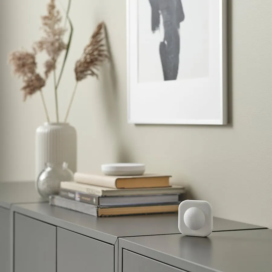{{< /carousel-slide >}}
{{< carousel-slide >}}
### Markdown too
Each slide takes **any** content - headings, lists, code.
{{< /carousel-slide >}}
{{< /carousel >}}

And with autoplay (auto=5) and text-only slides - their content is indented
so the arrows never cover it:
{{< carousel auto=5 ratio="21 / 9" >}}
{{< carousel-slide >}}### Slide one …{{< /carousel-slide >}}
{{< carousel-slide >}}### Slide two …{{< /carousel-slide >}}
{{< carousel-slide >}}### Slide three …{{< /carousel-slide >}}
{{< /carousel >}}
Chart #
A chart via self-hosted Chart.js, loaded only when the shortcode is present. The inner content is the Chart.js configuration as valid JSON; axes, grid and legend follow the theme and re-colour live when you toggle dark mode.
{{< chart title="Monthly visitors" >}}
{ "type": "bar",
  "data": { "labels": ["Jan", "Feb", "Mar"],
            "datasets": [{ "label": "Visitors", "data": [820, 932, 1290] }] } }
{{< /chart >}}
Gallery #
The gallery shortcode arranges several images as masonry columns. In
automatic mode you simply write one image per line; cols (optional,
default 3) sets the number of desktop columns, collapsing to a single
column on phones. All images of a gallery form one swipeable lightbox
group (PhotoSwipe); linked images ([](url)) stay plain links and
are not part of the group.
{{< gallery cols="2" >}}
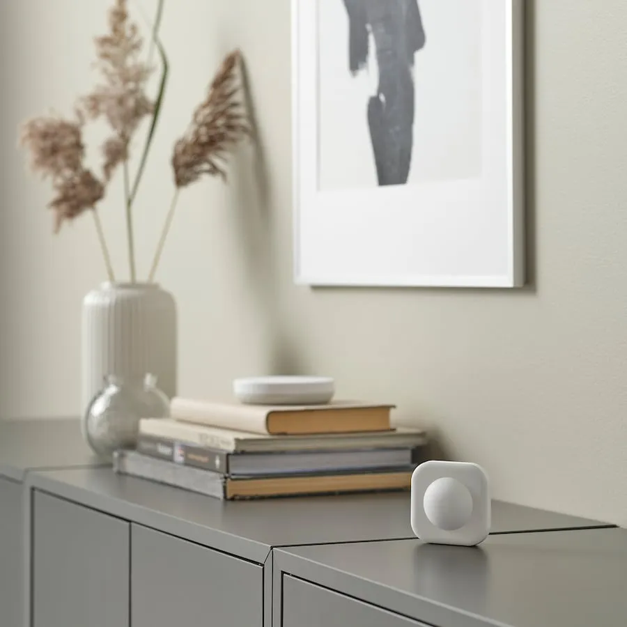
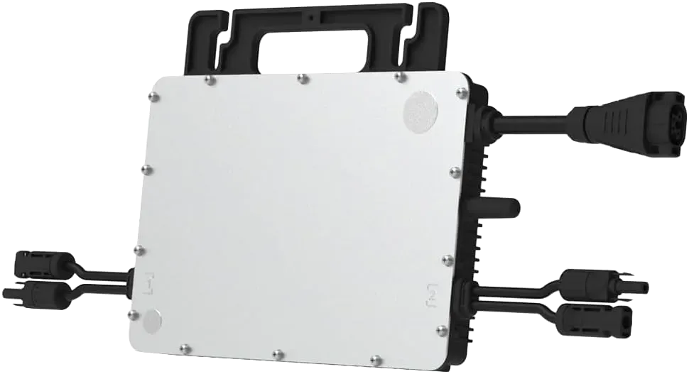
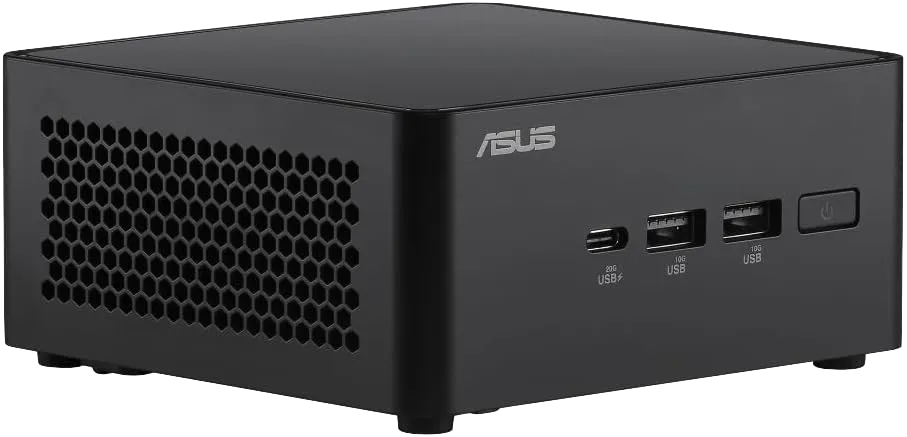
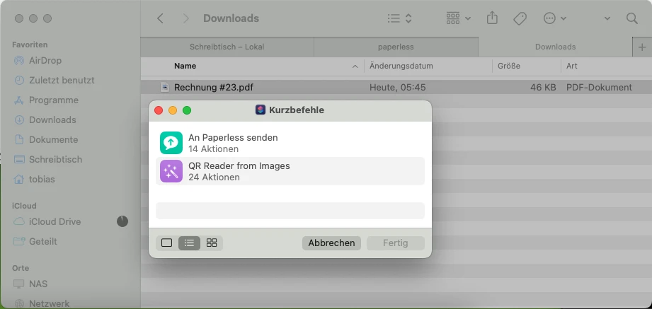
{{< /gallery >}}




Instead of the automatic split you can fill the columns explicitly with
nested gallery-column blocks - cols is then ignored and the number of
columns follows from the number of blocks. All the details (column logic,
captions, responsive sizes, linked images) are covered in
Images and galleries.
GitHub #
Embeds the OpenGraph preview of a repository. The external preview image only loads after consent via the consent manager Klaro - the link to the project always works.
{{< github repo="gohugoio/hugo" >}}
Icons #
{{< ti name >}} places a Tabler icon right in the text that scales
with the font size - e.g.
or
.
Any name from the Tabler outline set works
(deliberately outline only, not filled - the theme mounts just the stroke
set so every icon speaks the same line language).
KaTeX #
Place the marker shortcode {{< katex >}} on the page once - it loads
the (self-hosted) KaTeX renderer. After that you write math inline with
$ ... $ and display with $$ ... $$; KaTeX loads only when the marker is
present.
{{< katex >}}
Inline: Euler's identity $e^{i\pi} + 1 = 0$.
Inline: Euler’s identity $e^{i\pi} + 1 = 0$, and the Gauss sum in display:
$$ \sum_{k=1}^{n} k = \frac{n(n+1)}{2} $$Display, matrix and multi-line formulas are shown in Diagrams and math.
Lead #
A highlighted introductory paragraph. The content is rendered as Markdown.
{{< lead >}}
A **lead** paragraph sums up the post in a sentence or two.
{{< /lead >}}
Mermaid #
Write a diagram as text inside a mermaid shortcode. The (self-hosted)
Mermaid loads only when the shortcode is present and automatically follows
the light or dark colour scheme (including live toggles).
{{< mermaid >}}
graph LR
  A[Markdown] --> B[HTML]
{{< /mermaid >}}
graph LR
  A[Markdown] --> B[HTML]
Flowcharts, sequence, class, state, Gantt and further diagram types are shown in Diagrams and math.
Specs #
A spec sheet lists a product’s key facts as icon-labelled rows. Add title2
plus a value2 per row to turn it into a side-by-side comparison of two
products.
{{< specs title="Midea PortaSplit Cool" badge="Data sheet" >}}
{{< spec icon="snowflake" label="Cooling capacity" value="2.35 kW" >}}
{{< spec icon="tag" label="Price (RRP)" value="€899" >}}
{{< /specs >}}
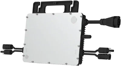
Pass title2 for a comparison of two products; image/image2 add a product photo per column and link/link2 a buy button:

Tabs #
Tabs group alternative content (e.g. per operating system). Tabs sharing the
same group synchronise site-wide: pick “macOS” in one group and all other
groups jump to “macOS” as well. group is only the internal sync key;
label sets the tablist’s screen-reader-announced name (without label it
falls back to the localized default “Tabs” - never the group key itself).
{{< tabs group="os" label="Operating system" >}}
{{< tab label="Linux" icon="brand-debian" >}}
`sudo apt install hugo`
{{< /tab >}}
{{< tab label="macOS" icon="brand-apple" >}}
`brew install hugo`
{{< /tab >}}
{{< /tabs >}}
Install via package manager:
sudo apt install hugo
Install via Homebrew:
brew install hugo
Install via Winget:
winget install Hugo.Hugo.Extended
With default="macOS" a tab other than the first is preselected; with
md=false a tab’s content is not interpreted as Markdown.
This second group uses the same group="os" - switch the operating system
above and watch it follow along (the choice is remembered, too):
~/.config/hugo.toml.~/Library/Application Support/hugo.toml.%AppData%\hugo.toml.