


 Max Mustermann
This post has a feature image: an image named feature.webp in the post
bundle is automatically picked up as the hero background. (Alternatively,
featureimage: in the front matter applies, or an image named
*background*/*cover*/*thumbnail* in the bundle, or the site’s
defaultBackgroundImage.)
The image render hook #
Every perfectly ordinary Markdown image is automatically converted to
WebP, served responsively in several sizes (srcset), lazy-loaded - and
zoomable via lightbox (PhotoSwipe). You simply write:
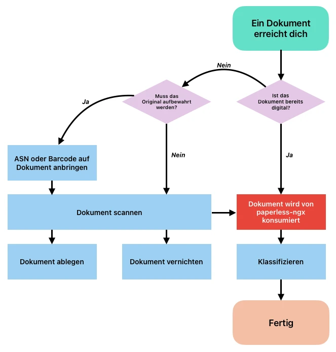

Clicking the image opens the full resolution. No manual converting, no linking to the original image.
Captions #
A Markdown title (in quotes after the URL) becomes the visible caption - and at the same time the caption in the lightbox:

Image sizes #
Via a block attribute on the line below the image you can limit the width -
small, medium, large or wide:

{class="medium"}
All four sizes side by side - small (narrow, e.g. for portrait
screenshots), medium, large and wide (breaks out of the text column):
Gallery - automatic #
The gallery shortcode lays out several images as columns (masonry). In
automatic mode you simply write one image per line; cols sets the
number of columns (default 3, 1 on phones). All images of a gallery form one
contiguous, swipeable lightbox group.
The split is sequential, not alternating: with six images and three columns, images 1-2 end up in the first column, 3-4 in the second and 5-6 in the third. On narrow viewports the columns dissolve and the images flow back underneath each other in source order. A caption (Markdown title, see above) works inside a gallery too - visible below the image and as the lightbox caption:
{{< gallery cols="3" >}}

{{< /gallery >}}






Gallery - explicit columns #
For full control over which image sits in which column, nest
gallery-column. The cols parameter is ignored in this mode - the
number of columns follows from the number of gallery-column blocks, and
within a column the images stack in the order you write them. That lets you
distribute portrait and landscape shots deliberately, or pin a particular
image to the top left. Lightbox grouping and mobile behaviour are the same
as in automatic mode.
{{< gallery >}}
{{< gallery-column >}}


{{< /gallery-column >}}
{{< gallery-column >}}


{{< /gallery-column >}}
{{< /gallery >}}
Linked images #
An image that is itself a link is not added to the lightbox group - handy for clickable logos:
[](https://gohugo.io)
Under the hood #
What the gallery takes care of in the background - no further parameters needed:
- Every image goes through the normal image render hook: WebP conversion,
several
srcsetsizes, lazy loading. - The
sizeshint is rewritten per gallery to the actual column width (with three columns roughly a third of the viewport) - so the browser fetches the smallest fitting variant instead of the full width. - The columns are flex columns, not CSS multi-columns: every column starts at the same top edge in every browser, with no engine-dependent balancing.
- On phones
display: contentsdissolves the columns - the images stack underneath each other in source order again.